Tableau Visualization
Tableau is arguably the biggest deal now in terms of data visualization for non-programmers. Let's pretend you are not a programer. Learn and experience what it is like to make visualizations using Tableau to answer the same questions about your classmates in our course.
For each of the question, think about what chart you should use to convey your answer and make your best effort to create something that makes sense to you. There's no right or wrong. When we meet in the class again, we will set aside time for each team to discuss and compare the variety of visualization solutions each member has come up with for the same set of questions. It will be fun!
To include a Tableau visualization in your report, take a screenshot, save it as an image,
put it in the learning/week2 folder, and replace 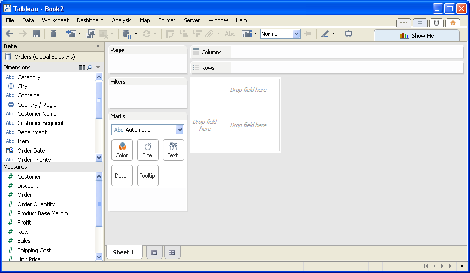 with
your own image. Please makes sure your screenshot includes the entire Tableau interface
including the controls, widgets ...etc.
How big the deal Tableau really is?
data visualization able to describe information through visual rendering. It provided different perspective than the raw data, providing a visual insight into the data. Tableau will able to connect different data source and transform it to visually understandable data. Tableau allow compatibility across multiple platforms and capable of handling big data analysis.
(Question 1)
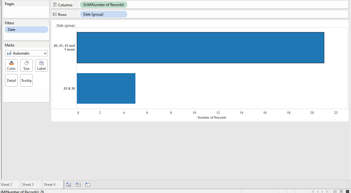
THE ANSWER IS 21 SAME AS DOING WITH LODASH, AND IF YOU LOOK AT THE LONGER HORIZONTAL, IT CLEARLY SHOW IT IS 21. Sorry! I don't know why the picture is not showing. So I provide here's a github link to the picture. https://github.com/Malaokia/book/blob/master/learning/week2/Q1.png
(Question 2)
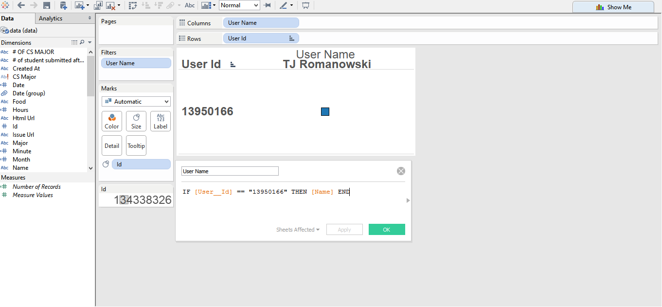
IT SHOW THAT USER ID MATCH WITH THE USER NAME
(Question 3)
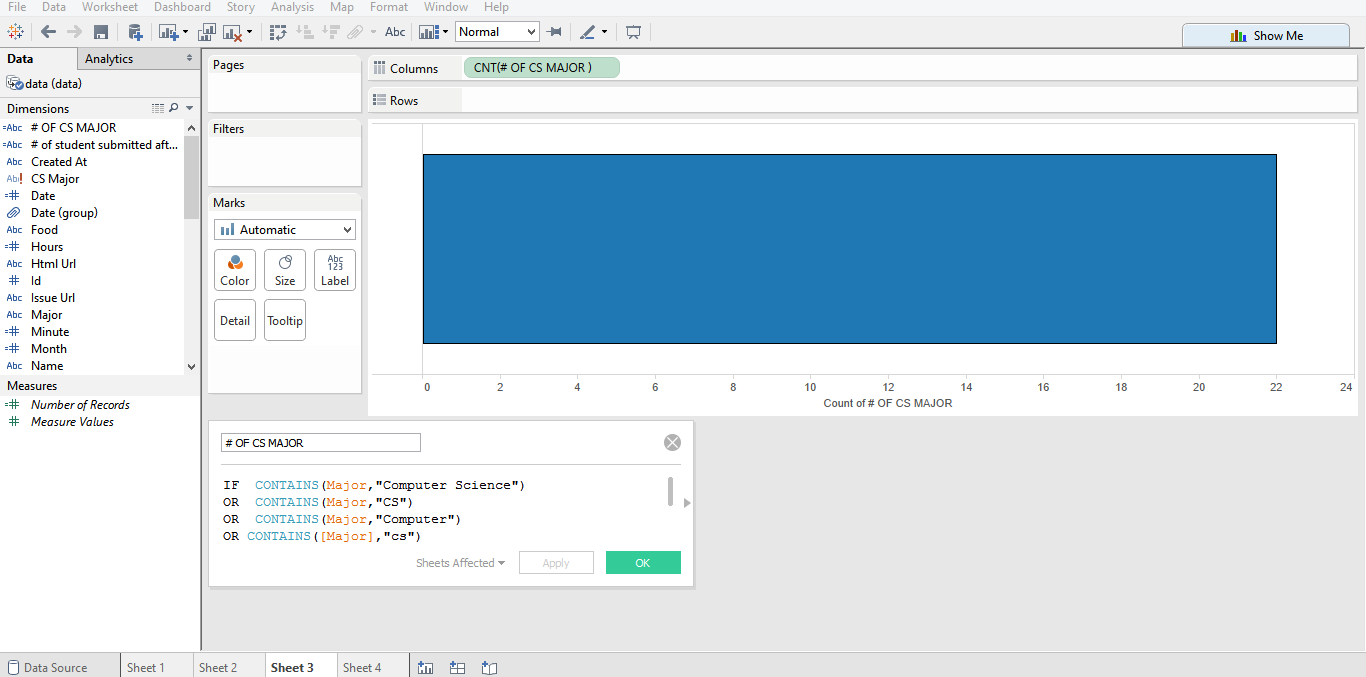
I USE ANALYSIS CODE TO DO THE VARIABLE. YOU CAN SEE THAT THE BAR CHART CLEARLY SHOW IT IS 21
(Question 4)
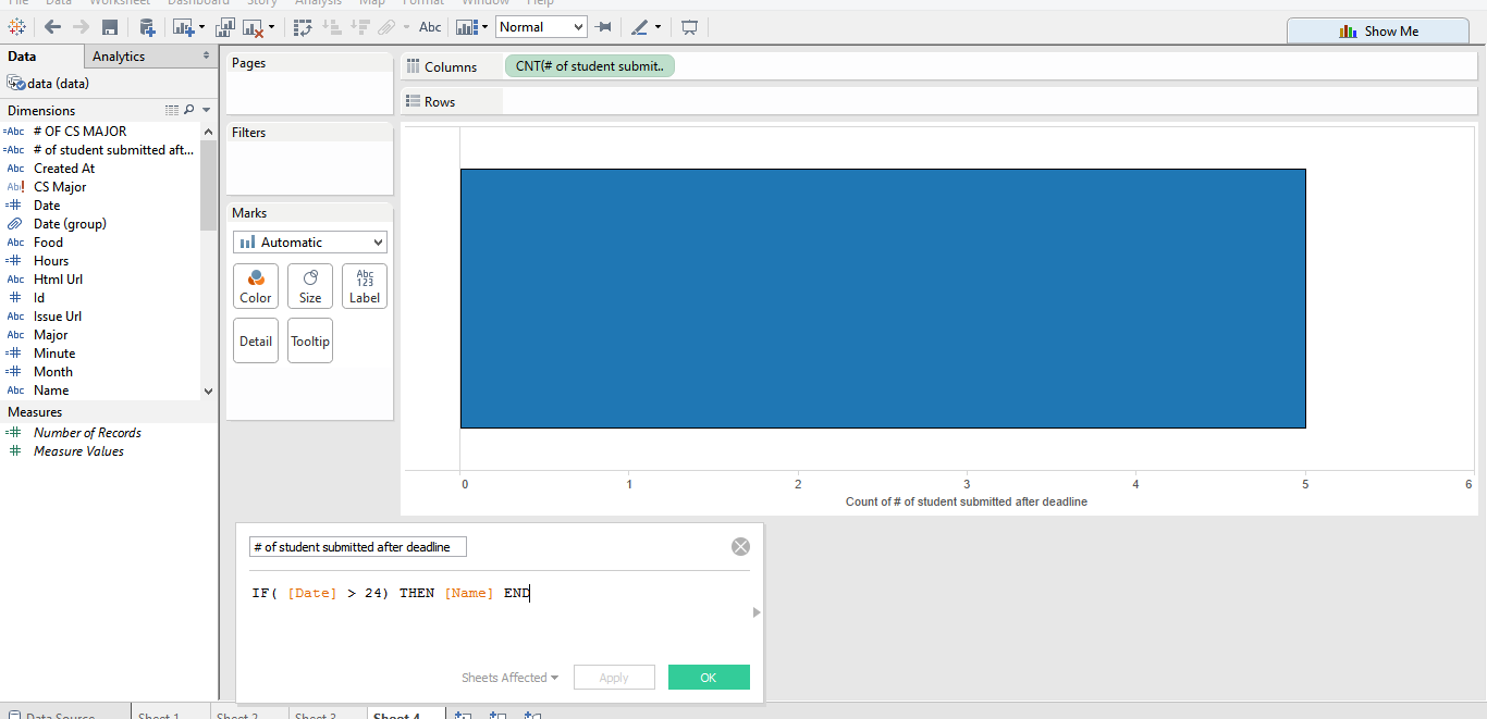
SAME AS THE FIRST QUESTION BUT I APPLY CODE THAT TAKE DATE THAT IS GREATER THAN 24